How to Choose Exterior Paint Colours That Stand the Test of Time
Your home's exterior is the first thing people see. It's what greets you after a long day. It sets the tone before anyone steps inside. And unlike that accent wall you can repaint next weekend, your exterior colour choices are a commitment, one you'll live with for years, possibly decades.
No pressure, right?
Choosing exterior paint colours can feel overwhelming. There are thousands of options, your neighbours are watching, and the stakes feel impossibly high. But here's what I've learned after helping countless homeowners navigate this exact decision: choosing timeless exterior colours isn't about following trends or playing it safe with beige. It's about understanding the unique elements of your home and making intentional choices that honour them.
Let's break down exactly how to choose exterior paint colours you'll love for years to come.
Why Exterior Colour Choices Feel So Daunting
Before we dive into the how, let's acknowledge why this decision feels so much harder than interior paint.
The visibility factor. Interior colour mistakes can hide behind closed doors. Exterior mistakes announce themselves to the entire street.
The permanence factor. Most homeowners repaint their exteriors every 10–15 years. That's a long time to live with a colour that doesn't feel right.
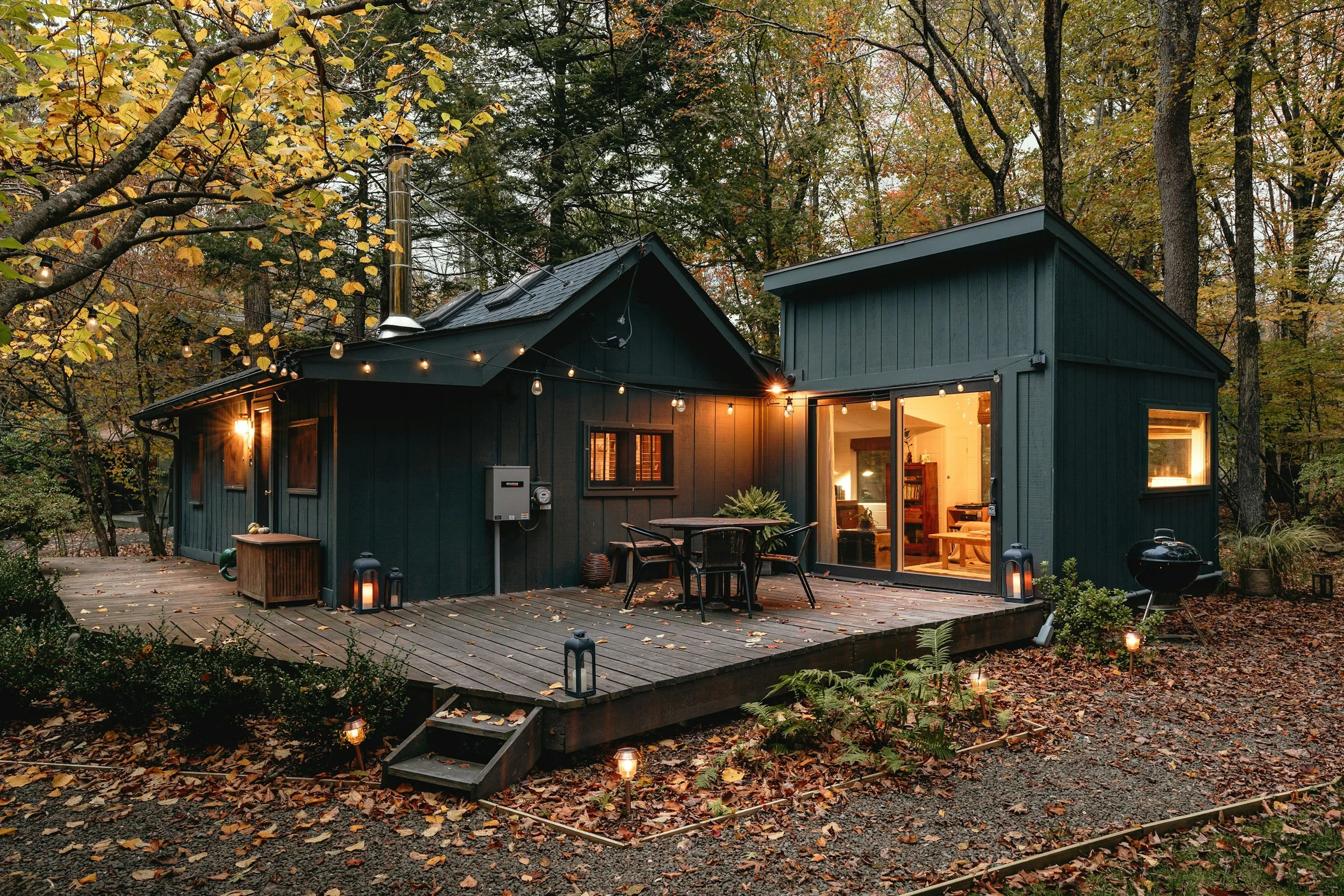
The complexity factor. Interiors have four walls and a ceiling. Exteriors have siding, trim, soffits, fascia, gutters, garage doors, front doors, shutters, and more, all of which need to work together.
The context factor. Your exterior doesn't exist in isolation. It's in constant conversation with your roof, your landscaping, your hardscaping, and yes, your neighbours' homes.
Understanding why this feels hard is the first step toward making it easier. You're not overthinking it, exterior colour genuinely is more complex. But with the right approach, it's absolutely manageable.
Start With What You Can't Change
Here's the secret that transforms exterior colour selection from overwhelming to strategic: work with your fixed elements, not against them.
Your fixed elements are the things that aren't going anywhere, at least not without significant investment. These include:
Your Roof
Your roof colour is typically your biggest fixed element. Is it charcoal? Warm brown? Weathered gray with blue undertones? Terra cotta? The undertones in your roof should guide (not dictate) your entire exterior palette.
I see this mistake constantly: homeowners fall in love with a siding colour that fights their roof. The result is a home that always looks slightly "off," even if they can't pinpoint why.
Stone, Brick, or Other Masonry
If your home has stone accents, a brick foundation, or masonry elements, these are non-negotiables. Note their undertones carefully. That "gray" stone might have significant beige warmth. That "red" brick might pull more orange or more brown depending on the light.
Your Landscape and Surroundings
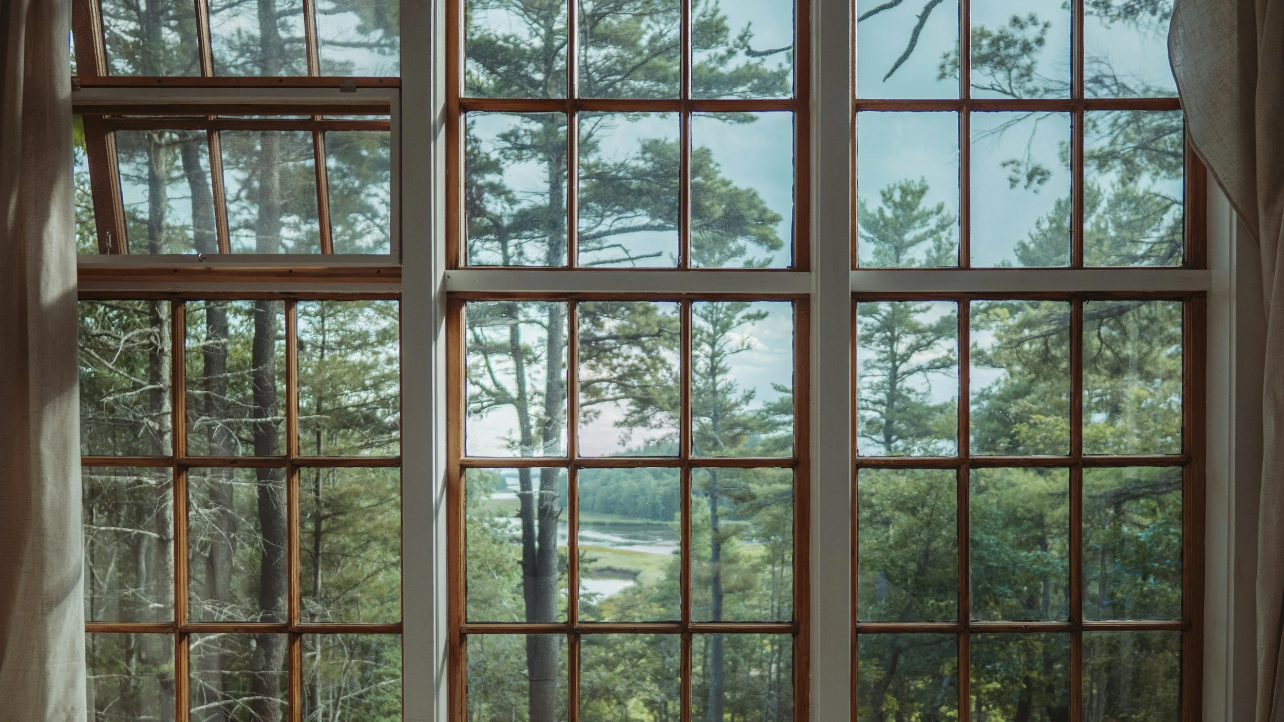
This is where Okanagan homeowners have a unique advantage—and challenge. Our landscape is stunning, with golden hills, evergreens, vineyards, and lake views. The colours you choose should complement this natural beauty, not compete with it.
Consider what's permanently in view: mature trees, rock features, neighbouring homes. These are part of your exterior's context whether you like it or not.
Windows and Architectural Details
The style, size, and placement of your windows influence how much trim colour shows and where the eye travels. Original architectural details, corbels, brackets, porch columns, might suggest a colour approach that honours your home's character.
The Five-Step Exterior Colour Strategy
Now that you've taken inventory of your fixed elements, here's my step-by-step process for choosing colours that last.
-
Walk outside and really look at your roof, not at noon on a sunny day (everything looks washed out), but in morning or late afternoon light. Ask yourself: Does it lean warm (brown, tan, rust) or cool (gray, blue, charcoal)? Are there multiple colours in the shingles? Most roofs have 2–3 colours when you look closely. What's the dominant undertone?
Write this down. Every other colour decision will reference this baseline.
-
This isn't about copying your neighbours, it's about understanding the visual conversation your home is part of. Take a walk or drive around your street and note: What's the general colour temperature? Are there homes with colour schemes you admire? What makes them work? Are there colour choices that feel jarring? Why?
Your home should feel like it belongs without blending into the background. The goal is harmonious distinction, coordinated but not identical.
-
Your siding is the largest colour field on your home, so it anchors everything else. Based on your roof undertone and neighbourhood context, narrow your options:
If your roof has warm undertones: Look at siding colours with warm bases, creamy whites, warm grays, sage greens with yellow undertones, warm blues (yes, blue can be warm!).
If your roof has cool undertones: Explore siding colours with cool bases, crisp whites, true grays, cool greens, slate blues.
Pro tip: Avoid going too matchy-matchy with your roof. If you have a brown roof, brown siding often looks muddy. Instead, choose a colour that complements without matching.
-
Once your siding colour is determined, trim becomes the frame. Classic approaches include:
White or cream trim: Timeless, fresh, works with almost any siding colour
Contrasting dark trim: Bold, modern, adds definition
Tonal trim: A slightly lighter or darker version of your siding for a sophisticated, subtle look
Your front door is your accent opportunity—the one place you can inject personality and boldness. A carefully chosen front door colour can elevate an entire exterior from "nice" to "stunning."
-
This step is non-negotiable. Paint colours look dramatically different on a small chip versus a large surface, in store lighting versus natural sunlight, on your phone screen versus in real life.
Large sample boards: Paint your top 2–3 choices on large poster boards (at least 2' x 2') and prop them against your home's exterior.
View at different times: Check your samples in morning light, afternoon light, shade, and full sun. Colours shift throughout the day.
Live with it: Leave your samples up for several days. Initial reactions fade; what matters is how the colour feels on day three.
Consider all angles: How does the colour look from the street? From your driveway? Walking up to your front door?
If this process feels overwhelming, professional exterior colour consultation can shortcut months of uncertainty into a few hours of clarity.
Timeless vs. Trendy: Finding the Balance
Let's talk about trends for a moment, because I know you've seen them. Navy blue exteriors. Black houses. Millennial pink doors.
Here's my philosophy: pay attention to trends, but don't design by them.
Trends can offer fresh perspective and expand your thinking about what's possible. But your exterior needs to work for 10–15 years, and most trends have a 3–5 year lifespan before they start feeling dated.
Colours That Stand the Test of Time
Some exterior colour approaches have proven longevity:
Classic white and cream: There's a reason these never go away. Clean, fresh, endlessly versatile.
Soft warm grays: The modern neutral that replaced beige, still going strong.
Deep greens: Forest, hunter, sage green connects to nature and ages beautifully.
Navy and deep blues: Bold but dignified; they've been used on homes for centuries.
Warm earth tones: Especially in landscapes like the Okanagan, colours that reference the natural environment feel grounded and permanent.
The Real Key to Timelessness
Here's what I've observed after years of studying exteriors: timelessness isn't about specific colours, it's about cohesion and intention.
A thoughtfully composed colour scheme with unusual colours will outlast a poorly considered scheme with "safe" choices every time. When colours feel intentional, when it's clear someone understood how all the elements work together, the result transcends trends.

Common Exterior Colour Mistakes (And How to Avoid Them)
After countless exterior consultations, these are the mistakes I see most often:
Mistake #1: Ignoring the Roof
I cannot stress this enough. Your roof isn't going anywhere, and fighting its undertone is a battle you'll always lose. Work with it.
Mistake #2: Choosing Colours in Isolation
That perfect blue looked amazing at the paint store. But at the paint store, you weren't standing next to your existing stone, under the light that hits your home at 4 PM, with the neighbors' taupe house in view.
Mistake #3: Going Too Light or Too Dark
Very light colours can look washed out and dingy surprisingly fast. Very dark colours absorb heat (important in Okanagan summers!) and show every imperfection. Middle values often photograph beautifully and age gracefully.
Mistake #4: Forgetting the "Fifth Wall"
Your garage door is often the largest single surface on your home's front face. It needs to be part of the plan, not an afterthought.
Mistake #5: Following Someone Else's Formula
Your sister's exterior colour scheme looked amazing on her 1950s ranch in the forest. That doesn't mean it will work on your modern farmhouse in a sunny subdivision. Context is everything.
When to Call In a Professional
DIY exterior colour selection is absolutely possible, I've given you the roadmap above. But there are times when professional guidance makes all the difference:
Your fixed elements are challenging. Unusual roof colours, stone with complex undertones, or architectural features that demand sensitivity.
You're paralyzed by indecision. If you've been staring at paint chips for months without progress, outside perspective can unlock clarity.
The stakes are high. Preparing to sell? Just invested in a major renovation? The wrong exterior colour can undermine significant investments.
You want to go bold but fear getting it wrong. This is my favourite scenario. You have great instincts—you just need someone to validate them and ensure execution matches vision.
An Exterior Design Consultation includes everything from inspiration analysis to site walkthrough, evaluation of existing features, personalized colour recommendations, and even painter referrals. It's designed to give you confidence before you commit.
Your Home Deserves to Make a Great First Impression
Your exterior colour choices matter. Not because of what the neighbours think (though yes, that's a factor), but because you deserve to pull into your driveway and feel proud. You deserve to walk up to your front door and feel welcomed.
Exterior colour is one of the most impactful decisions you'll make for your home. It's also one of the most forgiving when you approach it with intention, strategy, and respect for your home's unique context.
If you've been putting off this decision because it feels too big, I hope this guide has made it feel more approachable. And if you'd rather have an expert handle the complexity, someone who's seen thousands of exteriors and understands exactly how to make yours shine, I'm here for that too.
Curious about interior colour choices? Read about What a Colour Consultant Actually Does for the inside of your home.
Ready to Love Your Home's Exterior?
If you're ready to finally commit to exterior colours you'll love for years—or if you simply want expert eyes on your specific situation—let's talk.